
Charity · Mobile app · UX/UI · Design system
Turning intention into contribution
Making digital giving simpler, faster, and more meaningful for one of Oman’s leading charities.
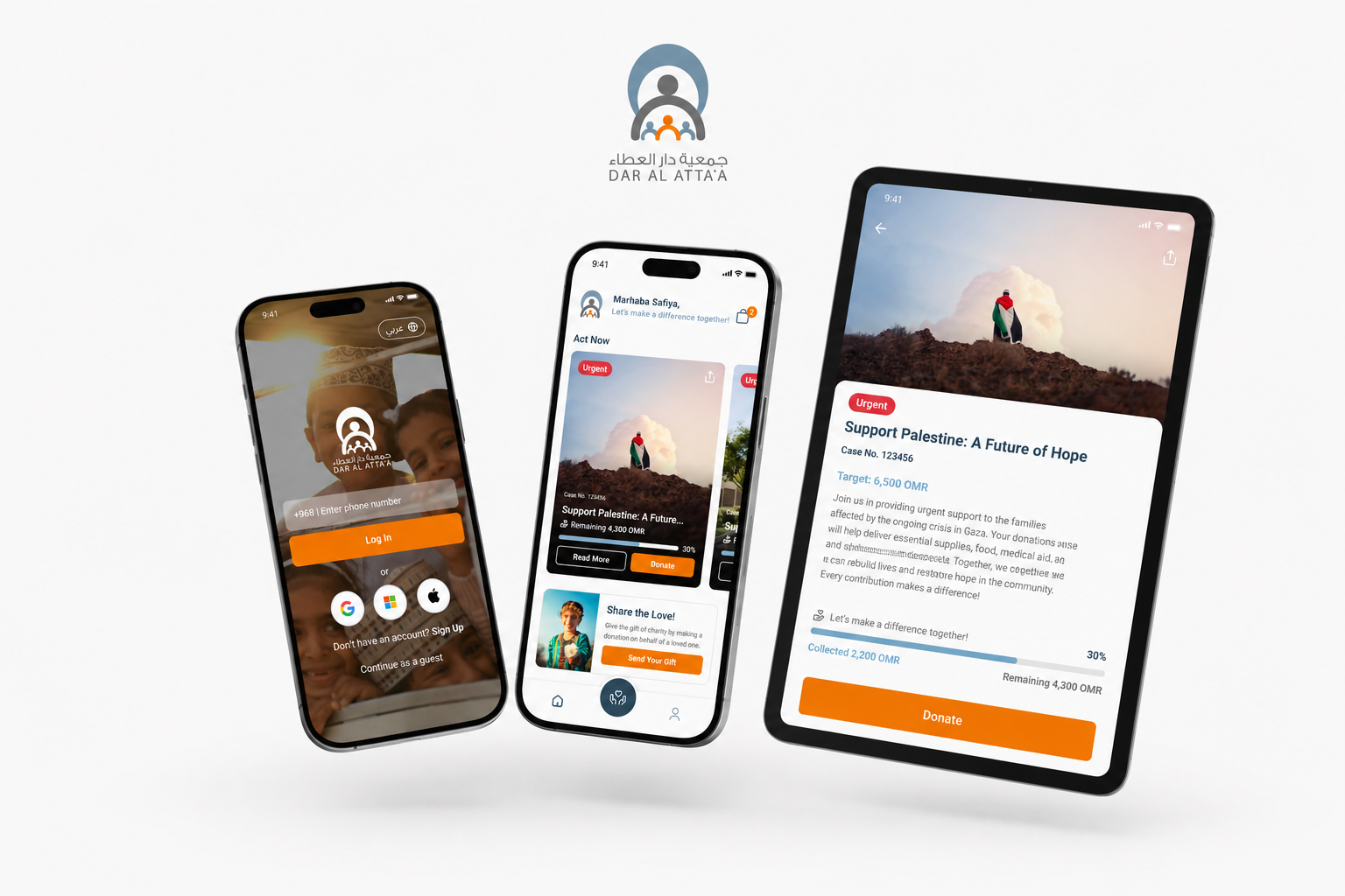
- Client
- Dar Al Atta'a
- Sector
- Charity and non profit
- Platform
- iOS and Android
- Role
- UI/UX design and research
About Dar Al Atta'a
Dar Al Atta'a is one of Oman's leading charitable organisations, connecting donors with initiatives that support individuals and families across the country.
Overview
Digital giving had become the organisation's main channel, so the app stopped being a supporting tool and became the primary way people give. That raised the stakes on every screen. The work was to make the distance between wanting to give and having given as short as it can honestly be, and to open a second route for people who want to give time instead of money.
My role
UI/UX design and research, end to end: journey review, stakeholder requirements, user flows, wireframes, high fidelity design, prototypes, developer handoff, UAT, and a post launch audit.
Platform
Mobile app for iOS and Android, in English and Arabic.
442,000+
Total users
72,000+
Active in the last 90 days
282,000+
Users who have donated
4.16M+
OMR raised to date
Dar Al Atta'a already had the reach. What it did not have was a path short enough to keep up with the moment someone decides to give.
Problem
Where giving was breaking down.
The problem was not attracting people to the app. It was what happened after they arrived.
The path was longer than the decision
Campaigns were hard to browse and harder to compare, and completing a donation ran through more screens than the choice warranted. Donation is an emotional decision on a short timer, often prompted by Ramadan, a crisis, or a story someone has just seen. Every extra screen is a chance for that feeling to pass.
Nothing made the cause, or the outcome, visible
There was little context about a campaign before committing: how much had been raised, how much was still needed, how urgent it was. Nothing afterwards confirmed what a contribution had done. Absence of that information does not read as neutral, it reads as risk.
An entire audience had no way in
Volunteers, people willing to give time rather than money, had no route into the organisation through the product, and no communication once they offered.
Research
What the research surfaced.
I reviewed the existing journeys and donation workflows end to end, mapped requirements with the Dar Al Atta'a team, and read what people were already saying about the app in public reviews.
- 01Account creation was a barrier, not a feature. A significant share of giving is occasional and one off, so asking for registration first asked people to commit to the organisation before they had committed to the cause.
- 02Trust needs to be visible, not assumed. Donors wanted to know what a campaign still needed, where the money goes, and that the transaction is secure.
- 03Giving is social. Donating on behalf of someone else is a familiar act of generosity in Oman, particularly around Ramadan and Eid, and the app had no way to express it.
- 04Repeat giving was harder than first giving. Regular donors repeated the whole flow every time, with nothing saved, no recurring option, and no history.
- 05Volunteers were an untapped audience with no managed way in.

Fatma, 35, teacher, Muscat
Regular donor
Comfortable with banking and shopping apps. Wants to give quickly, set up recurring donations, and see what her giving achieved. Frustrated by extra steps and by not knowing how funds are used.

Salim, 45, government employee, Nizwa
Occasional donor
Gives during Ramadan and in a crisis, and does not want an account or a commitment. Needs minimal steps and a simple confirmation. The person most likely to be lost to a registration wall.

Ahmed, 22, student, Sohar
Volunteer
Wants to contribute time rather than money. Needs to find opportunities near him, sign up quickly, know what is expected, and be kept informed.
Fatma and Salim defined the architecture between them: one path built for speed and return, one built for zero commitment, and neither could win at the other's expense.
Process
How the work ran.
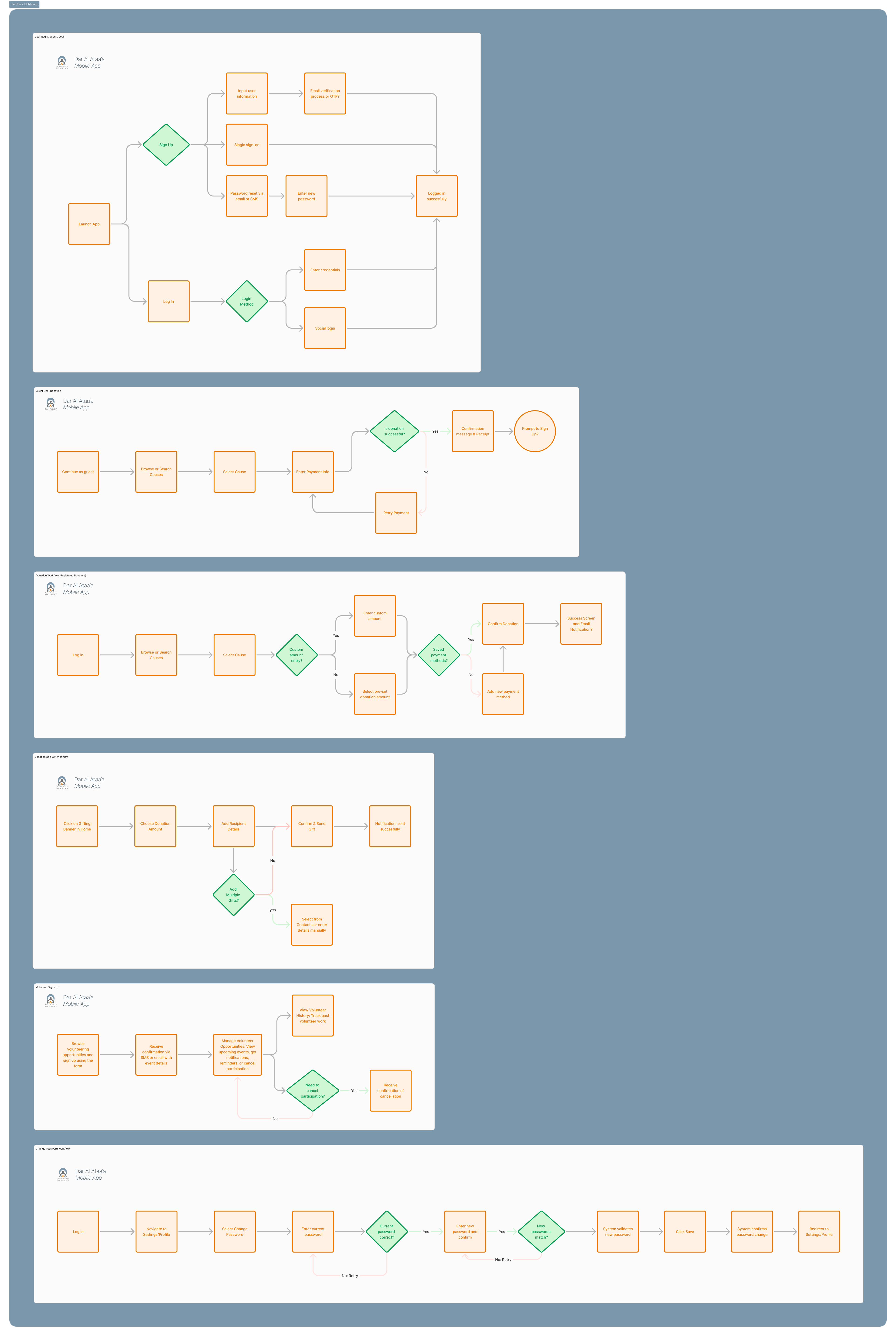
Every core journey was mapped before any interface work began: registration and login including single sign on, guest donation, registered donation, gift donation, volunteer sign up, and account management. Mapping first exposed the decisions that mattered, particularly where the guest path should and should not ask for an account, and what happens when a payment fails rather than only when it succeeds.
- 01Requirements and journey review with the team, with open questions resolved rather than assumed.
- 02User flows for every journey, including failure states.
- 03Sketching to generate options rather than pick one.
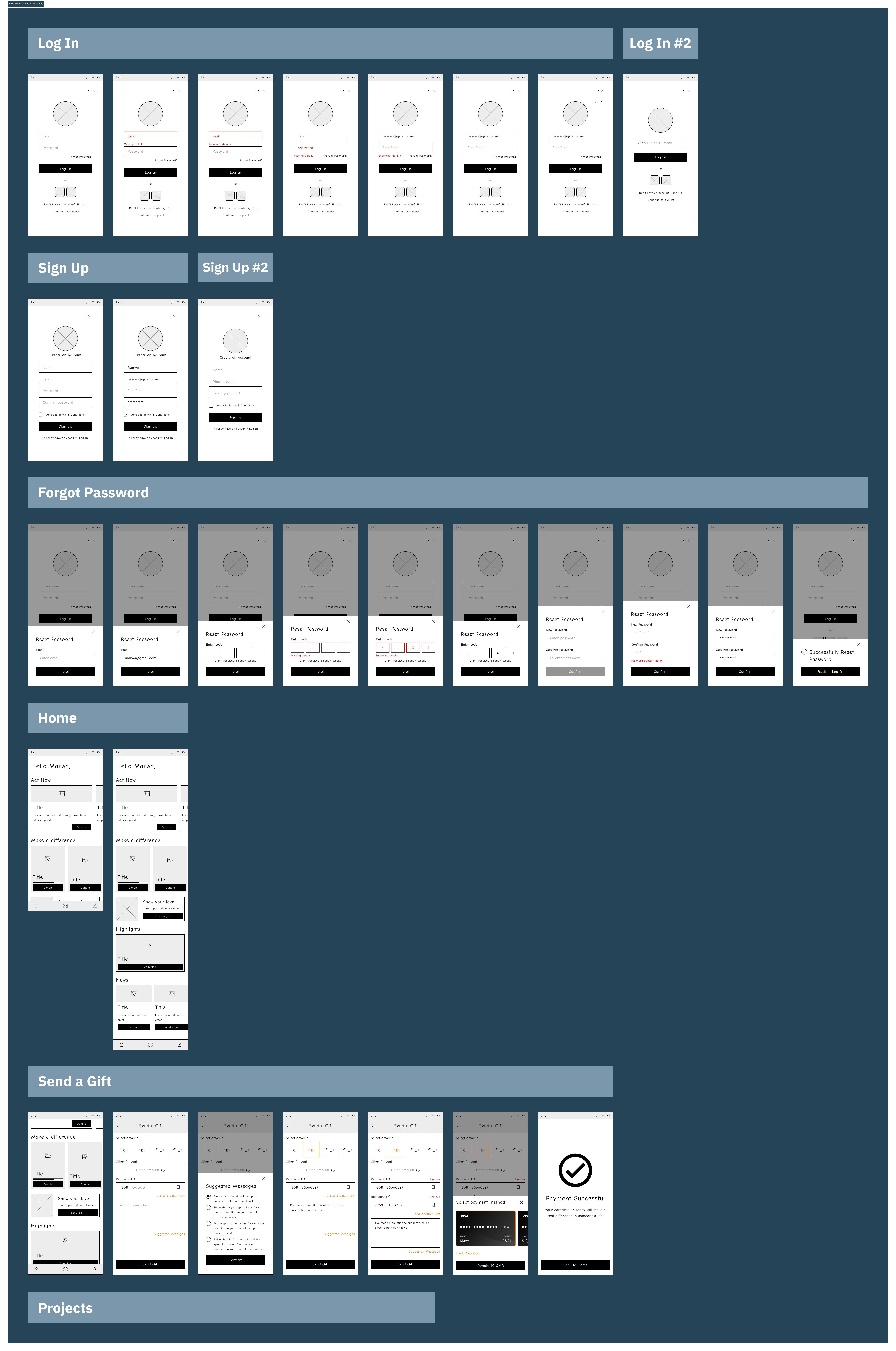
- 04Wireframes in greyscale, so client conversations stayed about flow and priority rather than colour.
- 05A low fidelity prototype as the approval gate. Agreement on structure early meant later changes were refinements rather than rework.
- 06High fidelity design across the full screen set, with deliberate attention to the moments that carry emotional weight: the campaign card, the amount, the confirmation, the success state.
- 07Review sessions in every phase, because design decisions in a charity carry organisational and cultural weight.
- 08Developer handoff with support through the build, then UAT and usability testing before release.
Solution
What the app does now.
Six changes carry most of the outcome.
Guest donation
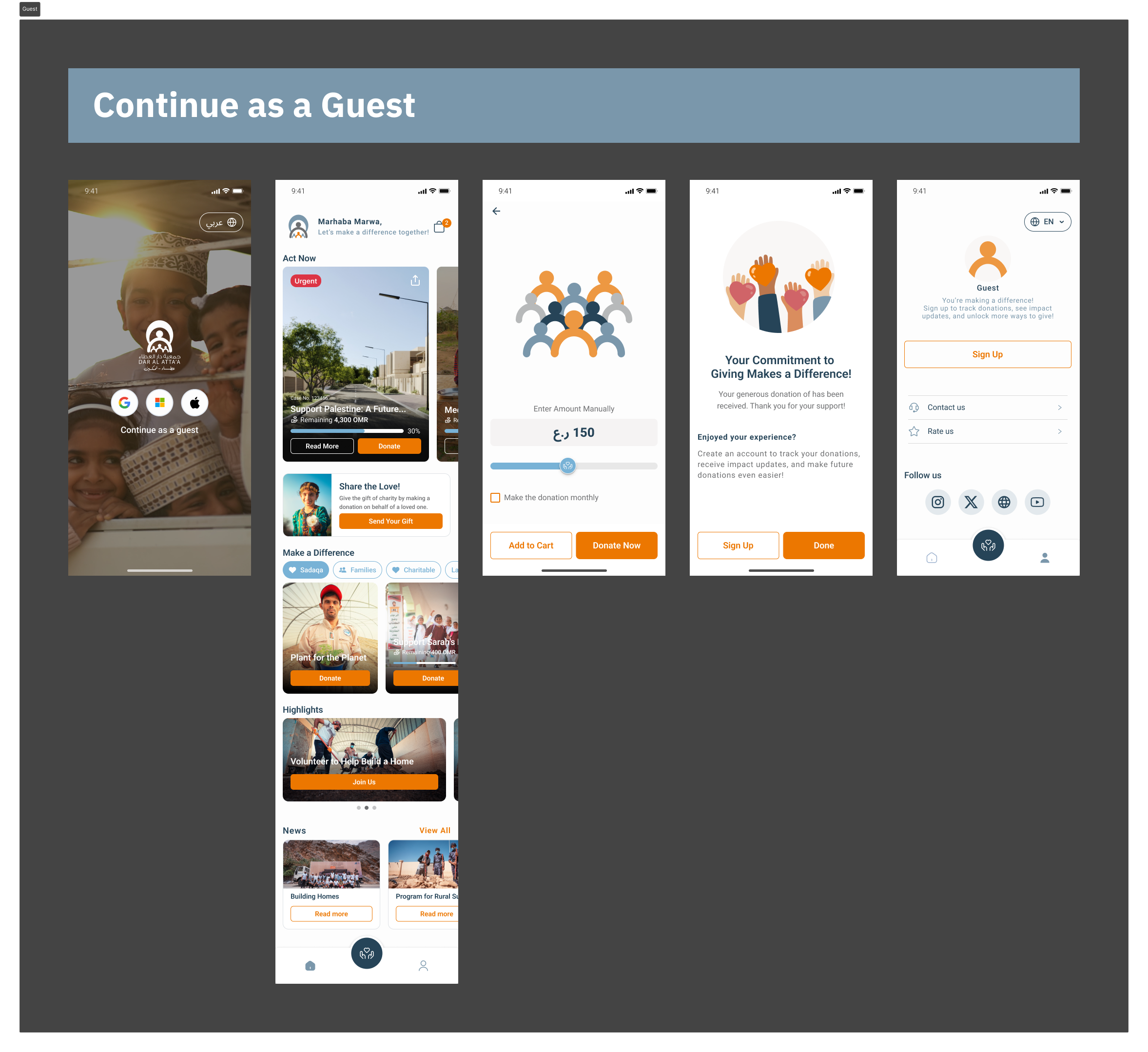
The most important structural decision in the project. Someone can open the app, browse or search causes, choose one, complete the donation, and receive a confirmation and receipt without creating an account. The sign up prompt comes after the donation, not before it. That gave Salim a path that had not existed, and closed the point where occasional donors were being lost.
Campaign discovery and context
Causes sit in categories such as education, healthcare and disaster relief, with search for donors who arrive with a specific intent. Each card carries the amount still needed, progress toward the goal, urgency, and a direct donate action. The principle was that the card should be enough: nobody should have to open a detail page to understand whether a cause needs them.
A donation flow built for both speed and repetition
Quick donate from the home screen, pre set amounts alongside custom entry, saved details for returning donors, several causes supported in one transaction, and recurring donations for people who want to give monthly without repeating the decision. Every donation ends in a confirmation and a receipt, the moment that tells a donor the intention actually landed.
Gifting, because it was already happening
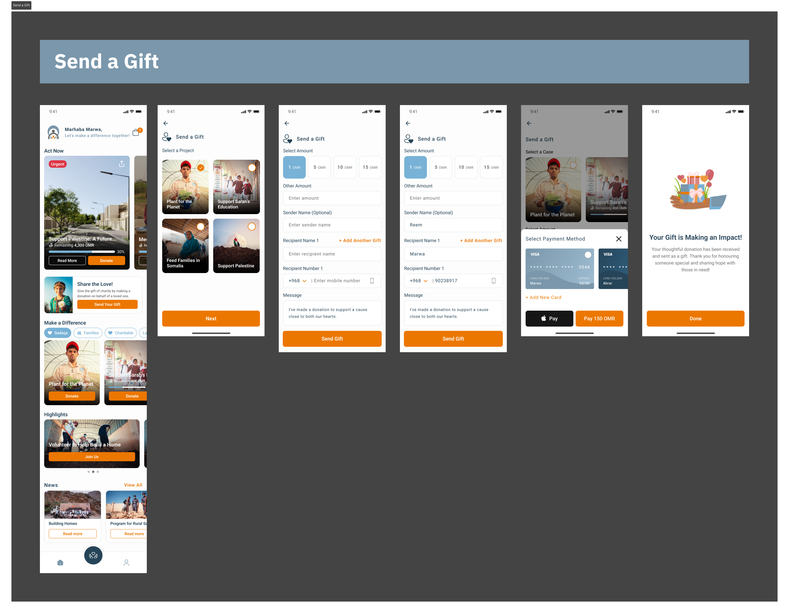
Donations can be sent as a gift, chosen from contacts or entered manually, with a personalised message delivered by SMS, email or WhatsApp, and several gifts sent in one flow. This was not a secondary feature. It is an established form of generosity in Oman, especially around Ramadan and Eid, and it had simply been left outside the product.
A real volunteer path
Volunteers browse opportunities, register through a form, receive confirmation and event details, manage upcoming commitments with reminders, cancel cleanly, and see their history. The organisation gained a managed volunteer base instead of an informal list.
A profile that turns one donation into the next
Donation history with cause, amount and date, management of recurring giving and saved details, personal information and password control, news and events, and account deletion. History does more than record transactions. It is where a one time donor becomes a repeat donor.
Design system
One language across the app.
Typography, colour, spacing, components and states were built as a consistent system. The purpose was practical rather than aesthetic. Consistency is what makes an unfamiliar screen feel safe at the moment someone confirms a payment, and a shared component set is what kept the experience coherent through development and after it.
Impact
Where it landed.
The redesigned experience now supports 442,000 or more users, 72,000 of them active in the last 90 days, with 282,000 or more people having donated and more than 4.16 million OMR raised to date.
Public reviews reflect the same intent the design was built around. Donors describe the app as clean and simple, and credit it with getting their contribution directly to the causes that need it.
After launch
Treating it as something to keep measuring.
A follow up audit reviewed the live experience across four stages, discover, define, design and prioritise, covering stakeholder context and app structure, the donation journey and its friction points, and visual hierarchy and accessibility. It produced a prioritised P1 to P4 roadmap, with each item tied to a business implication rather than a design preference.
Highest priority items
- 01Keep a prominent donation entry point above the fold, shortening the path from intent to action.
- 02Standardise campaign cards so remaining amount, progress, urgency and the donate action always appear.
- 03Improve campaign title legibility so the cause is clear from the card alone.
- 04Add a pre payment summary confirming amount, campaign, receipt expectation and security.
- 05Run an accessibility pass across contrast, labels, tap targets and text over imagery.
- 06Strengthen receipting and impact storytelling after the donation, to support repeat giving.
Learnings
What I took from it.
This project made the link between interface decisions and social outcome unusually direct.
- 01Removing a registration step is a small decision on paper. In practice it decided whether an entire category of donor could participate at all.
- 02Gifting was not a feature we invented. It was a behaviour that already existed in people's lives and had been left outside the product.
- 03In a donation experience, friction and hesitation are the same thing, and a paused donation is usually an abandoned one.
- 04The generosity was already there. The work was removing everything standing between that impulse and the person it was meant for.