New Visual Identity for A’Safwah Dairy
Overview
This project was one of the projects I worked on one of the classes as a student at Harbour Space University in Barcelona, the main goal was to choose a local brand that isn’t doing so well, and design a new identity for it.
Background
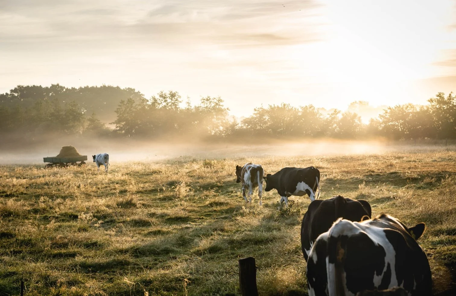
A’safwah Dairy is the only largest vertically integrated dairy company in sultanate of Oman. The company has remarkable goodwill, producing premium quality fresh milk, dairy products and juices which are sold both in Oman and overseas, under the brand name A'Safwah Milk and Dairy products and A'Safwah Beverages.
Brand Audit
First, I had to do a brand audit, what kind of products do they have, and see how the brand is doing on social media and how does their brand identity look like.
Audit Analysis
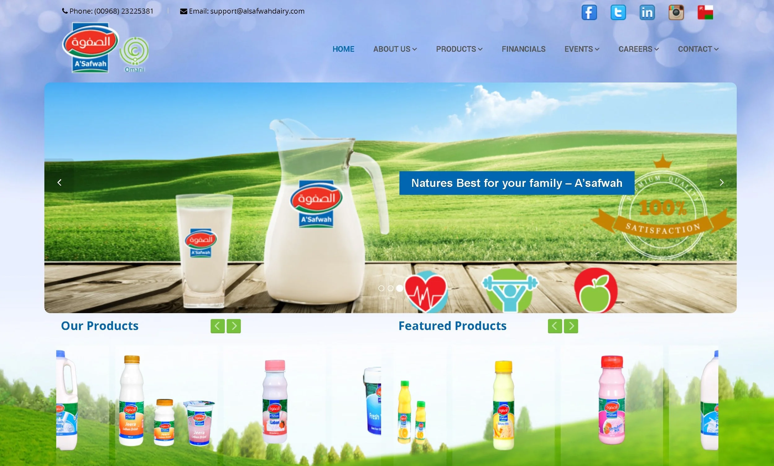
The brand doesn’t have an identity. The only thing available is this outdated logo.
Their social media presence is actually good compared to how outdated the visual identity is. They’re doing better on Instagram.
The packaging is outdated and unattractive.
They have so many products, it will be better if they can focus on multiple products rather than having so many options that doesn’t really taste good.
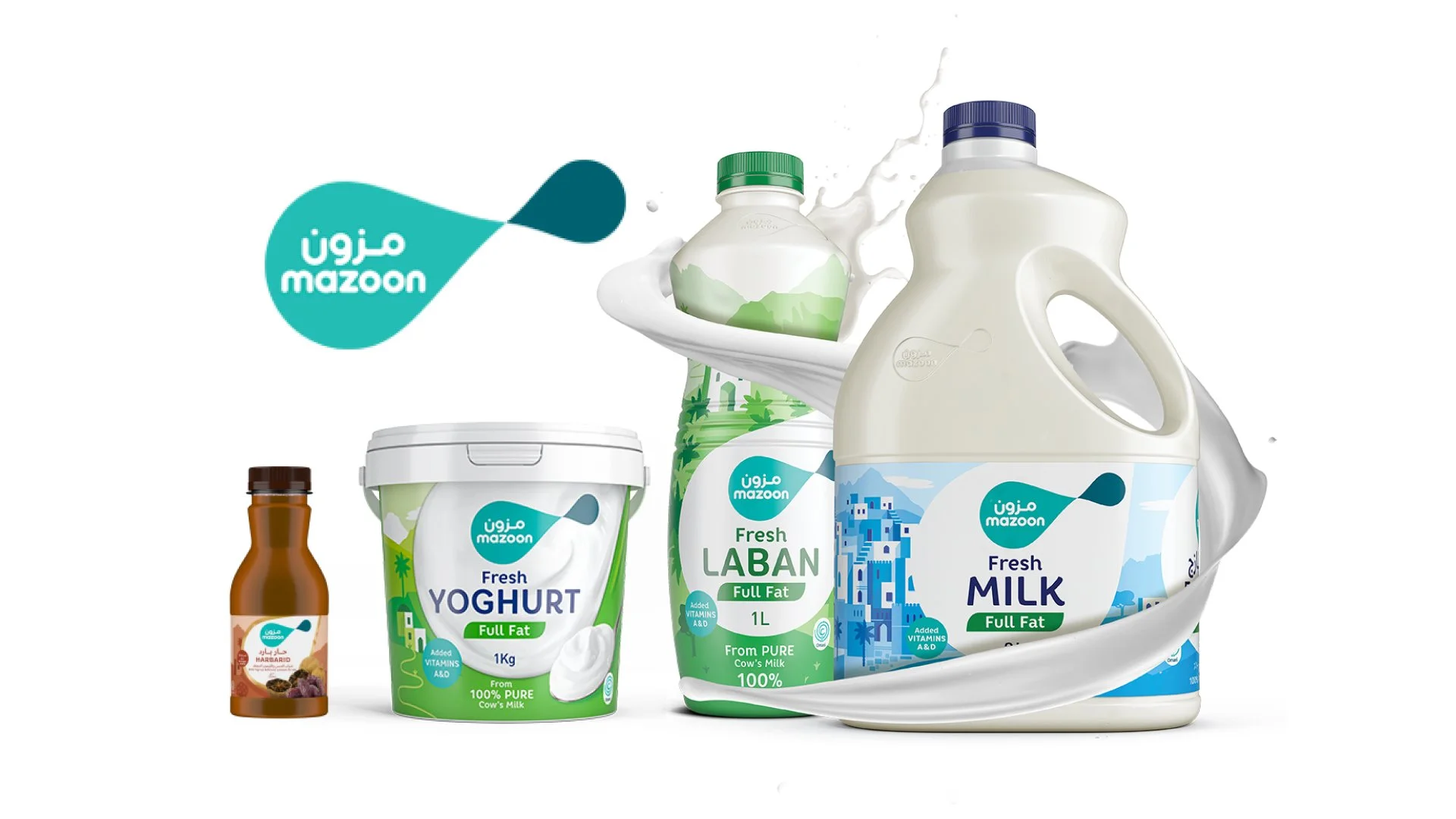
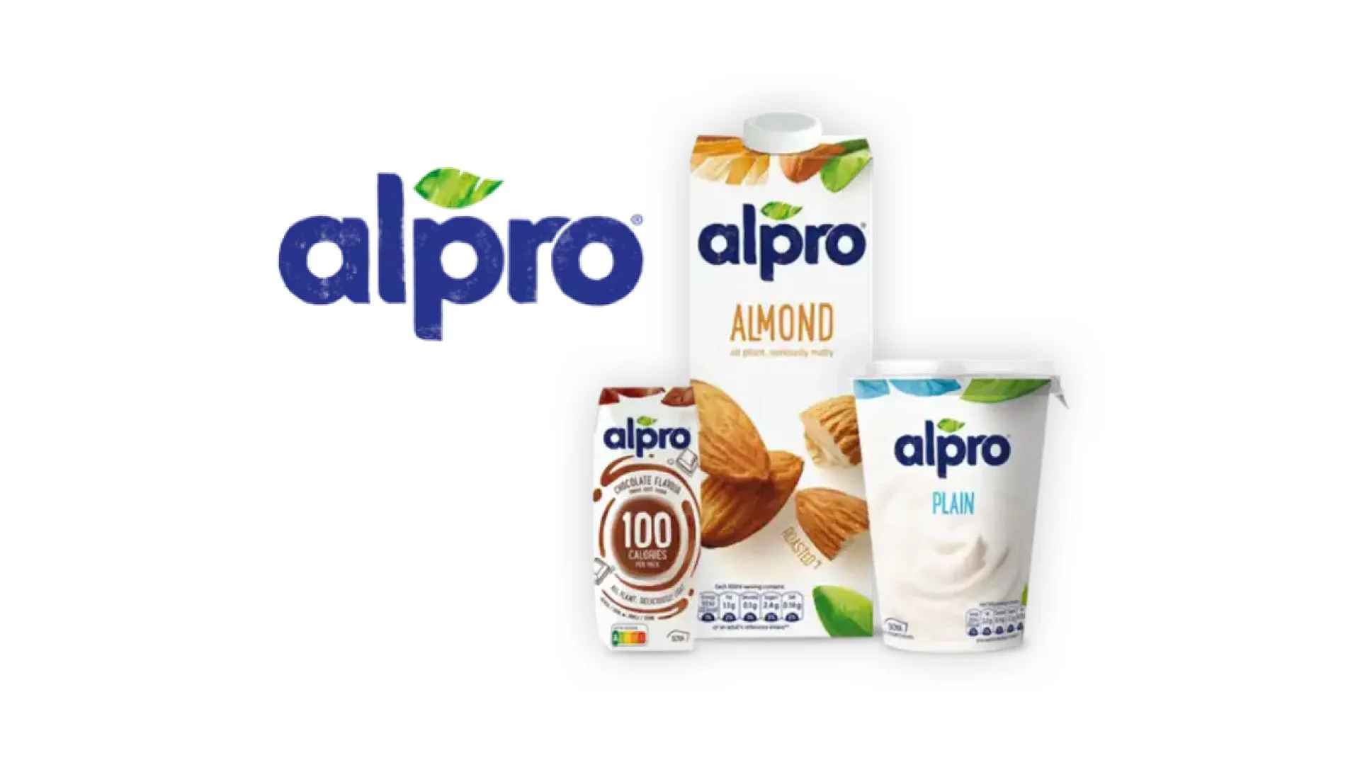
Competitive Research
After completing the brand audit, I had to do a competitive research and see how the brand is doing compared to their competitors. So for this research i chose Alpro & Mazoon Dairy.
Both competitors that we researched were doing great and had a unique visual identity, and both their websites had a good user experience.
Competitive Research Analysis
Visual Identity is important, the more creative the design is, the more people are attracted and exposed to. Introducing new products that are unique and innovative helps the company gain more popularity.
Having a clear mission helps the company on knowing which audience to target. Providing alternatives to consumers and having a strong message is what makes a company successful.
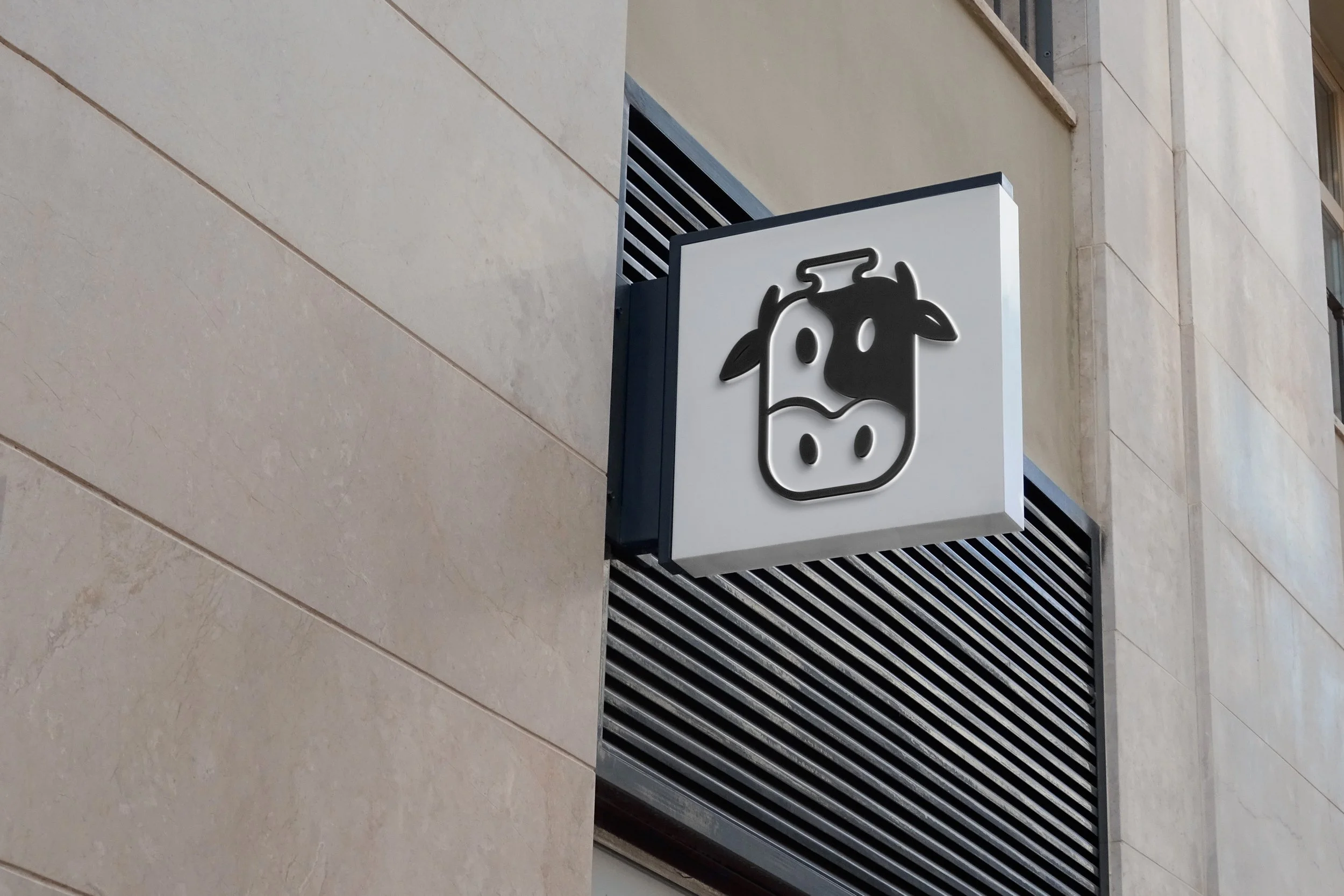
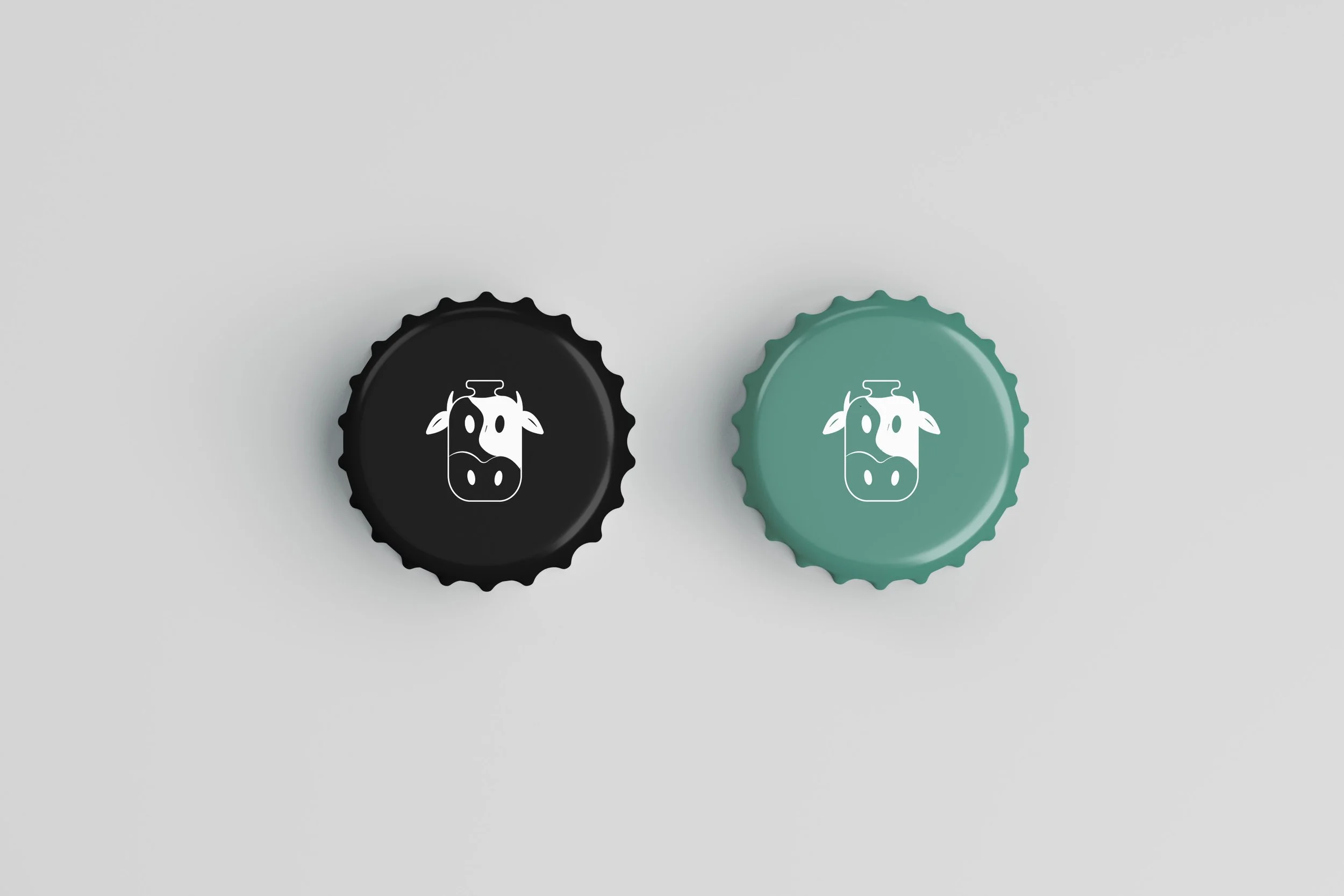
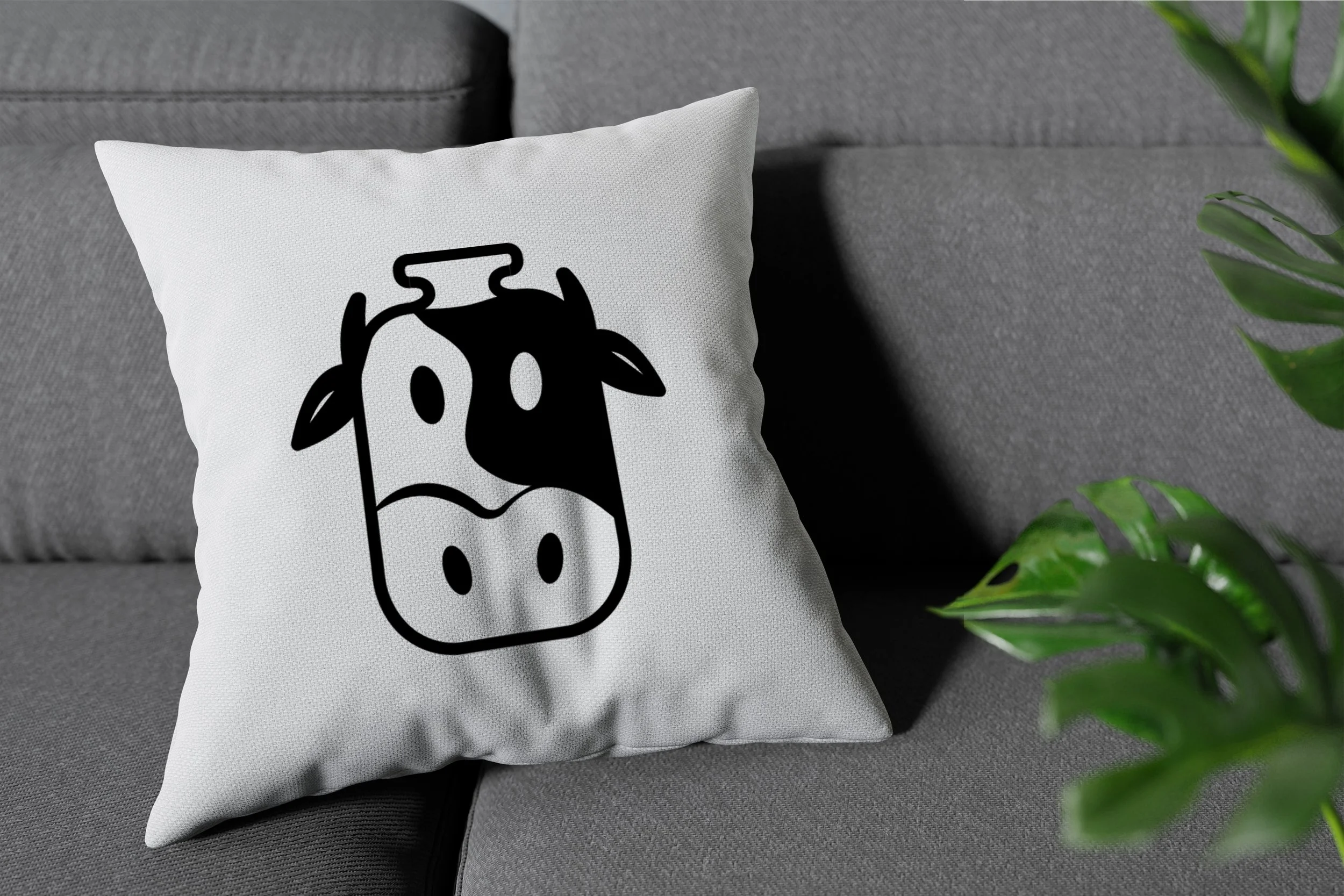
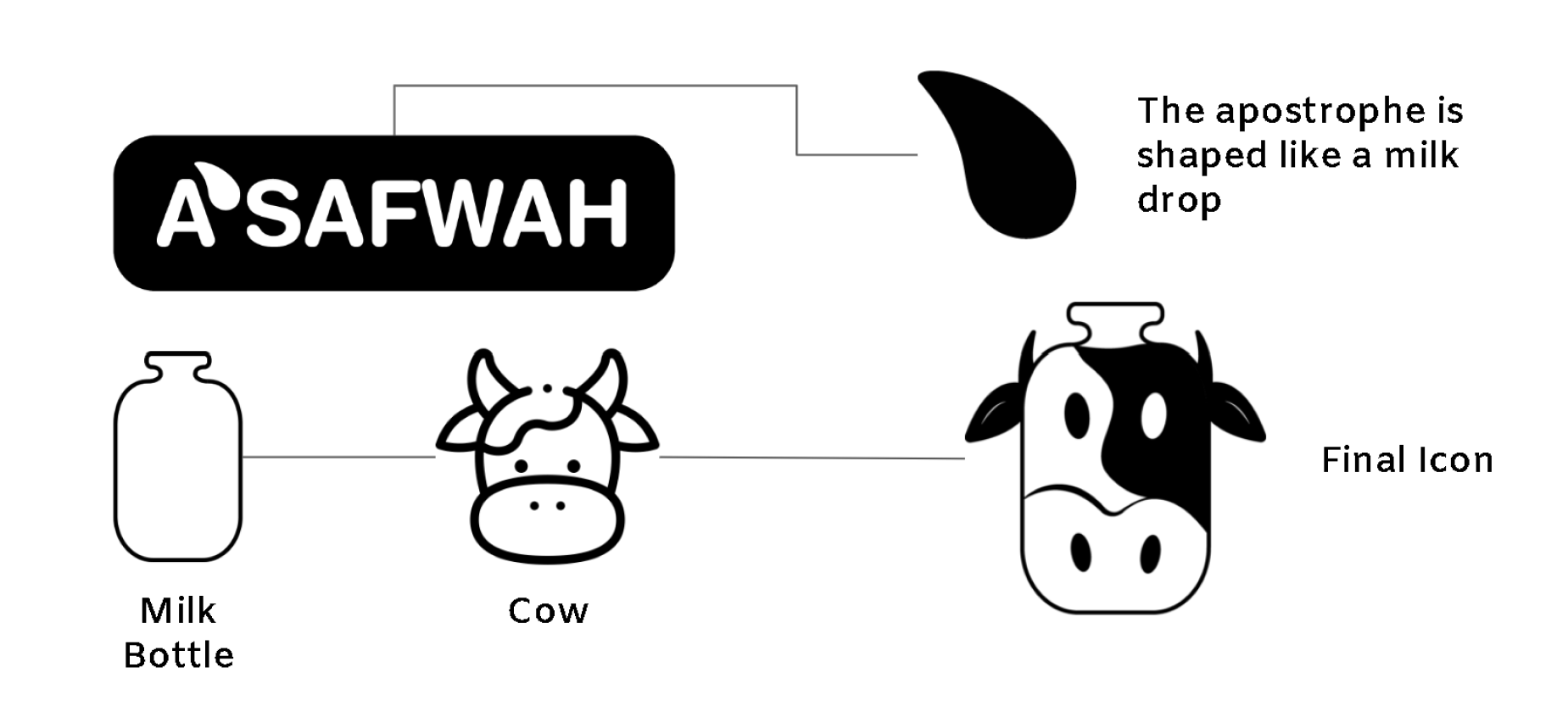
Logotype & Icon
First thing i did when i started the design process, was to design a new logo for the brand. The old logo was not working for them and looked outdated.
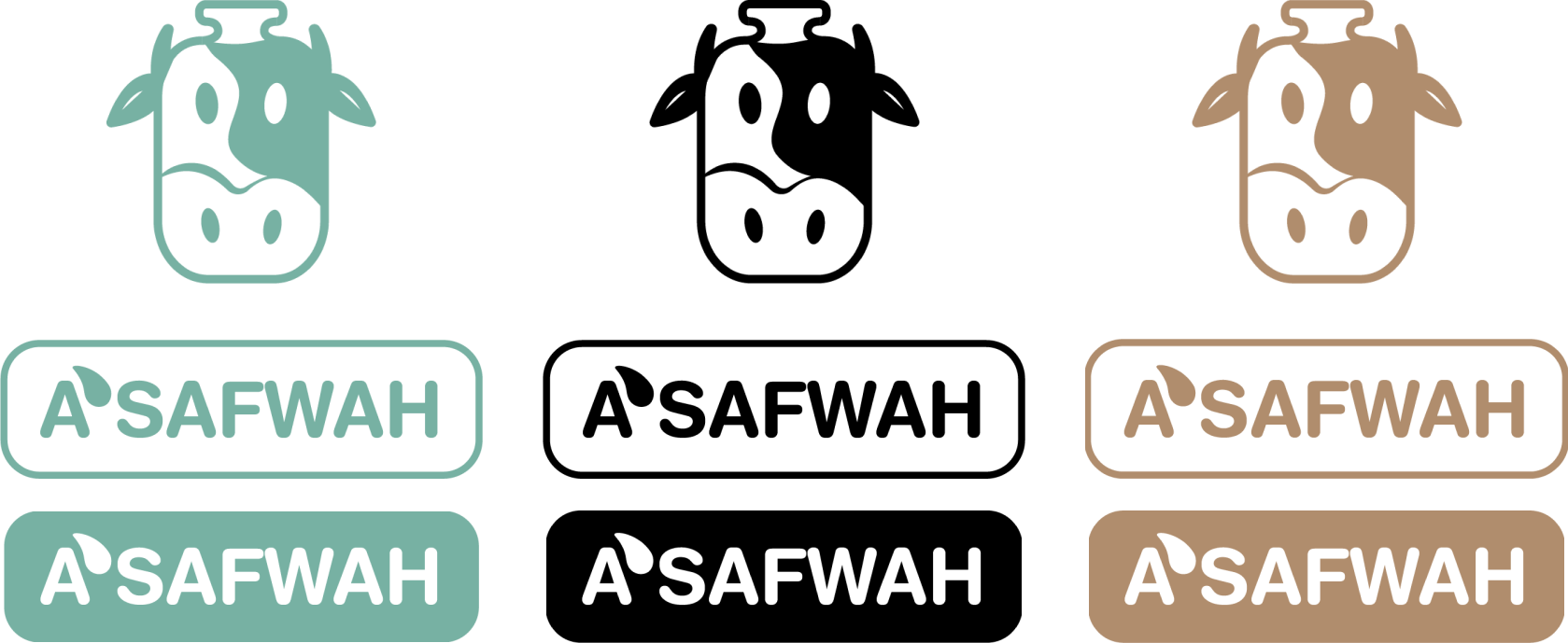
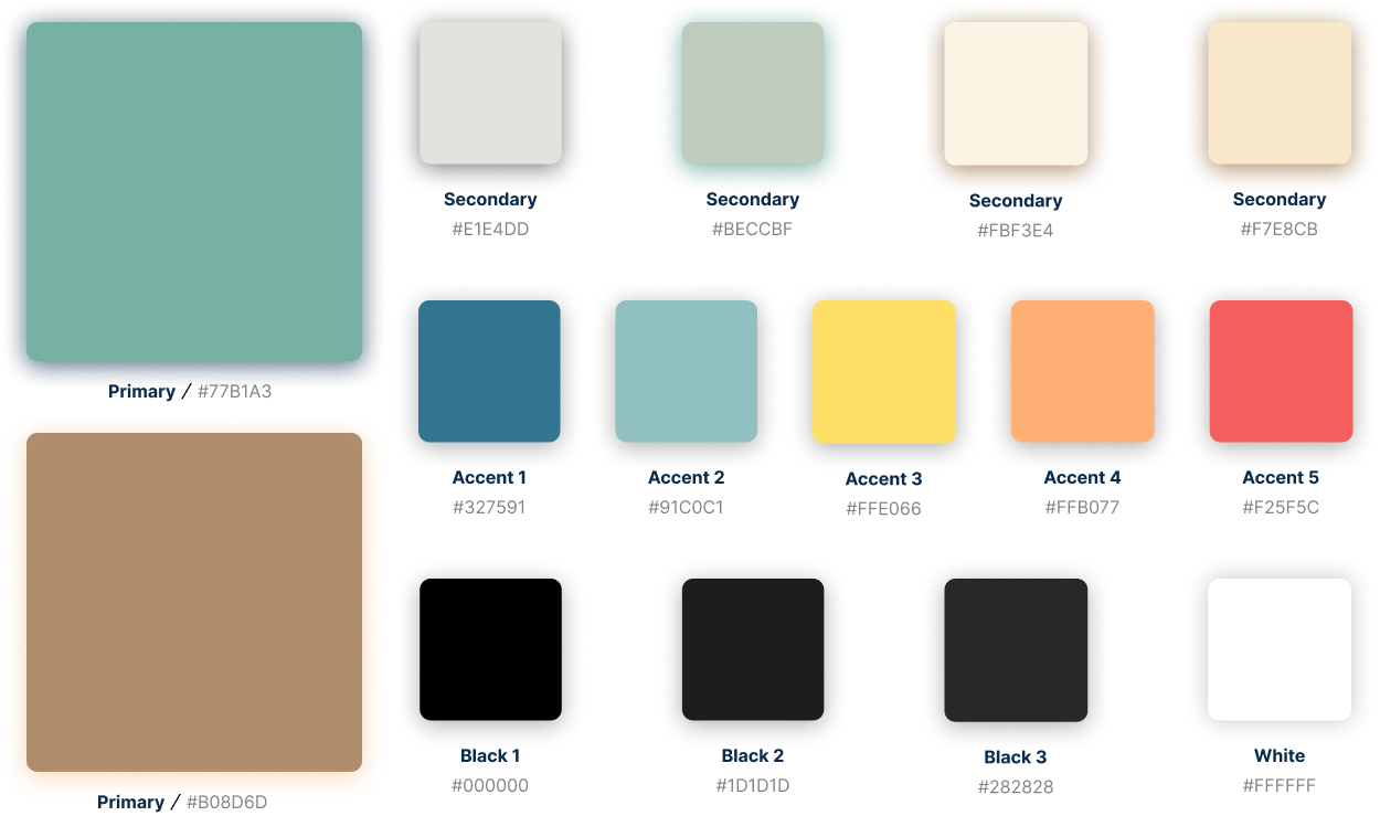
Color Palette
For the color palette we have Primary, Secondary, Blacks and Accent colors. The color palette was made to give an earthy, natural feel to our brand.
Typography

Graphic Elements
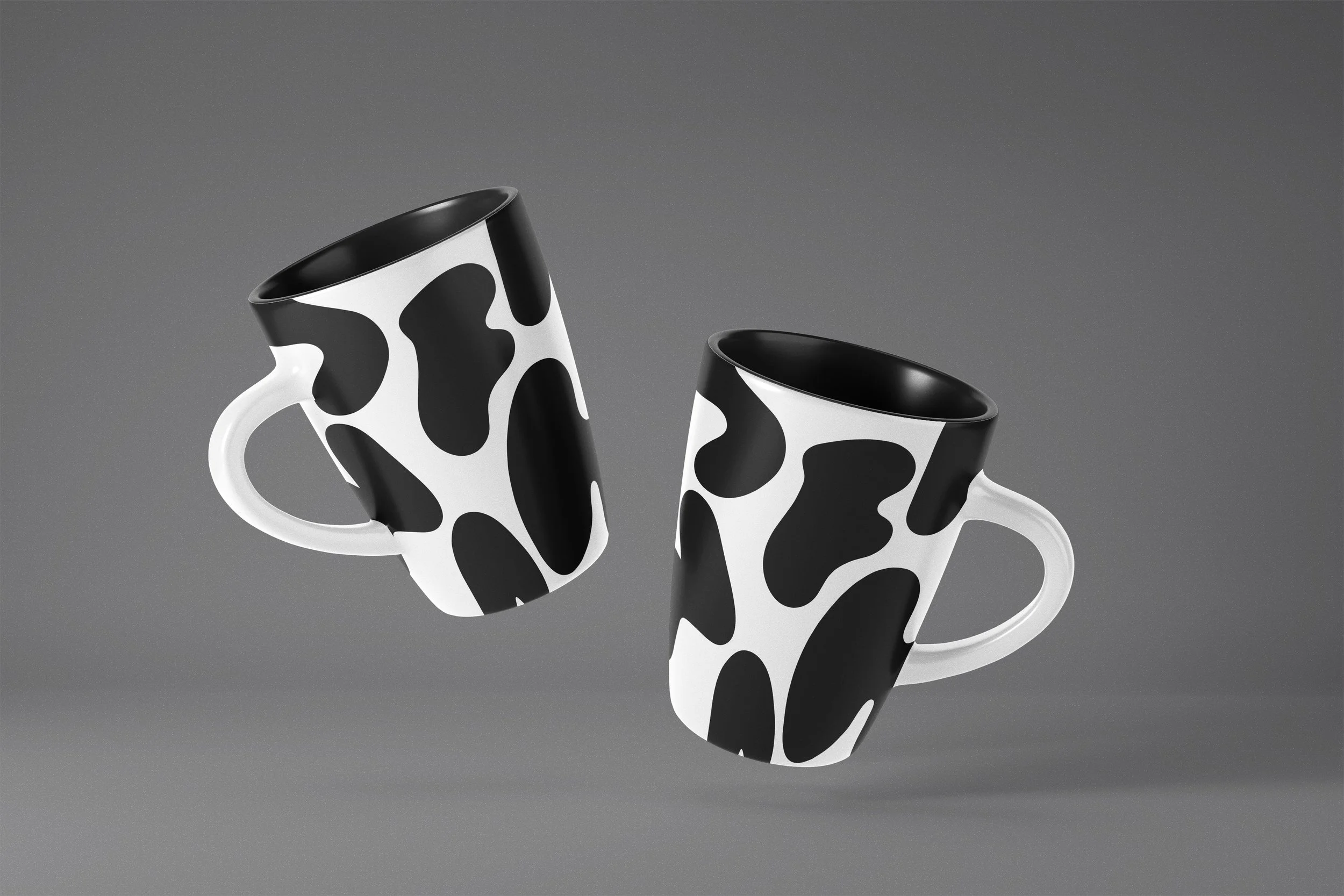
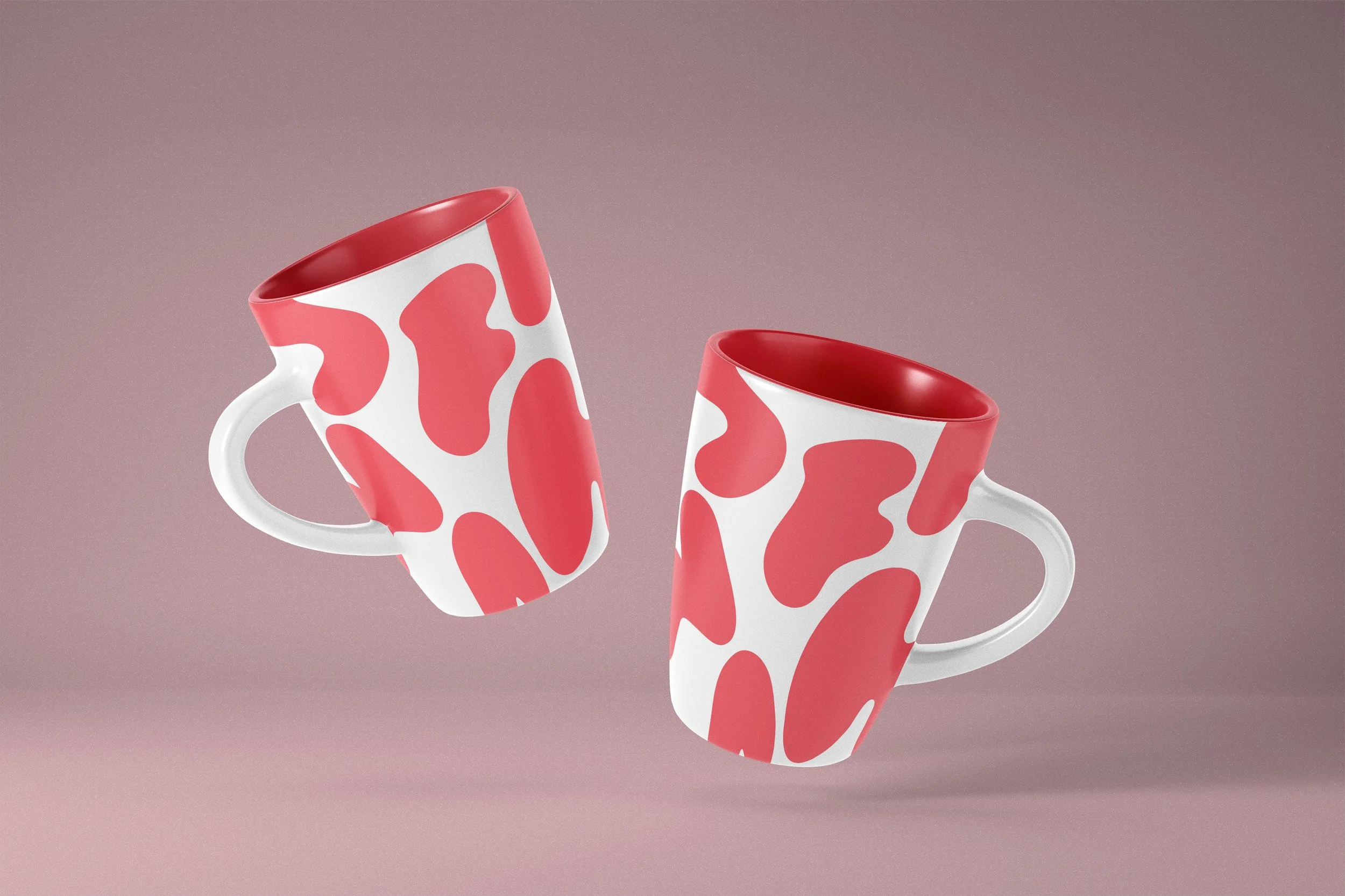
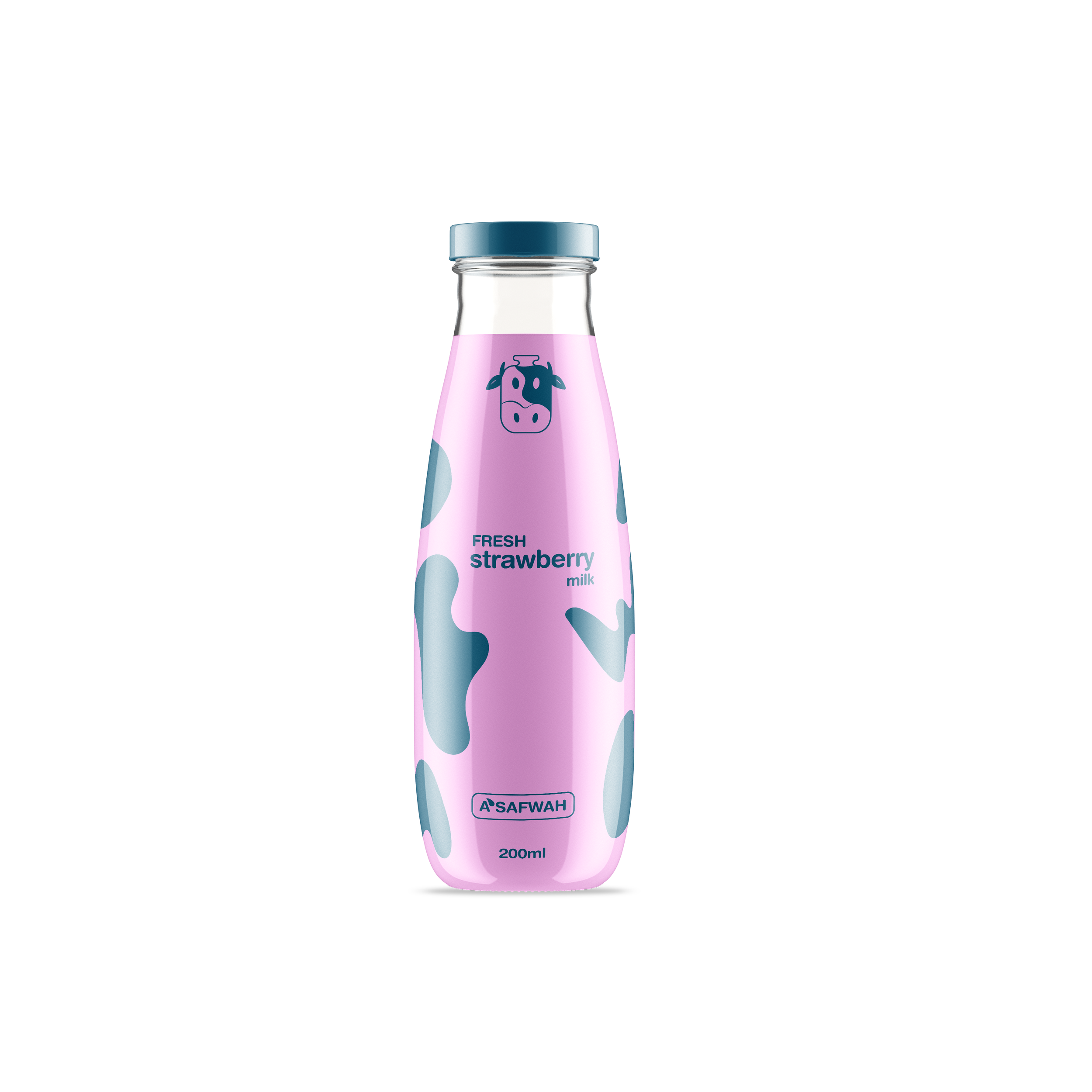
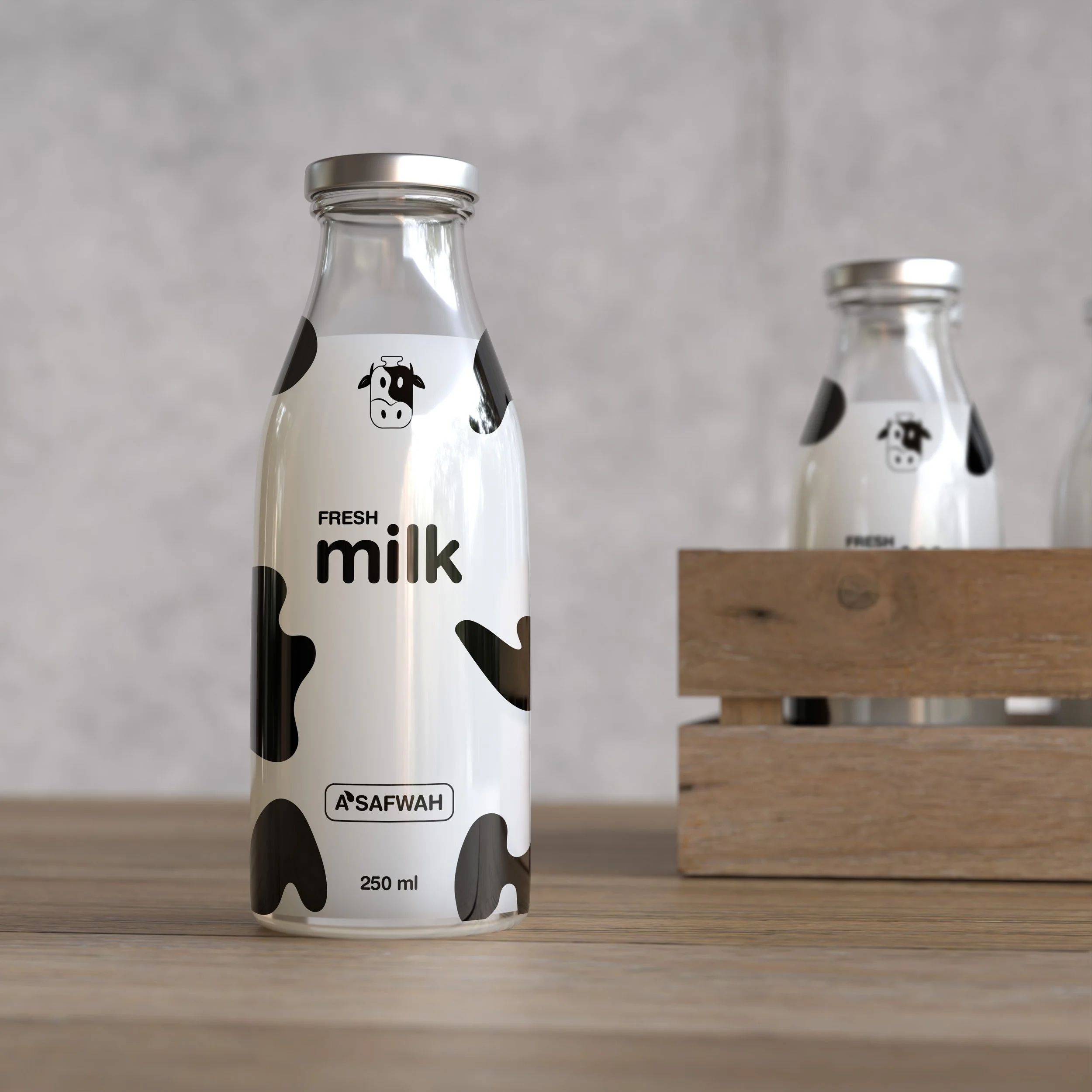
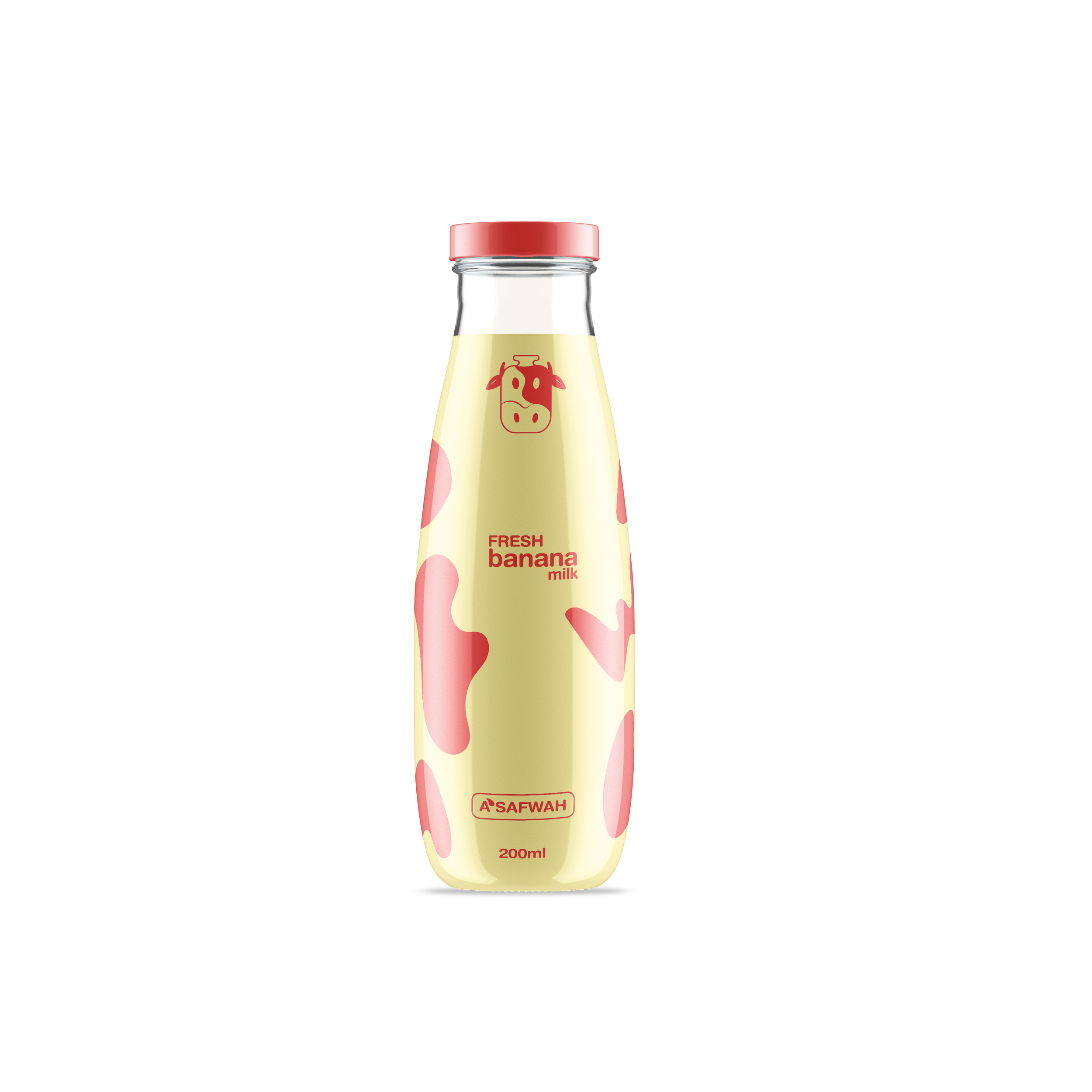
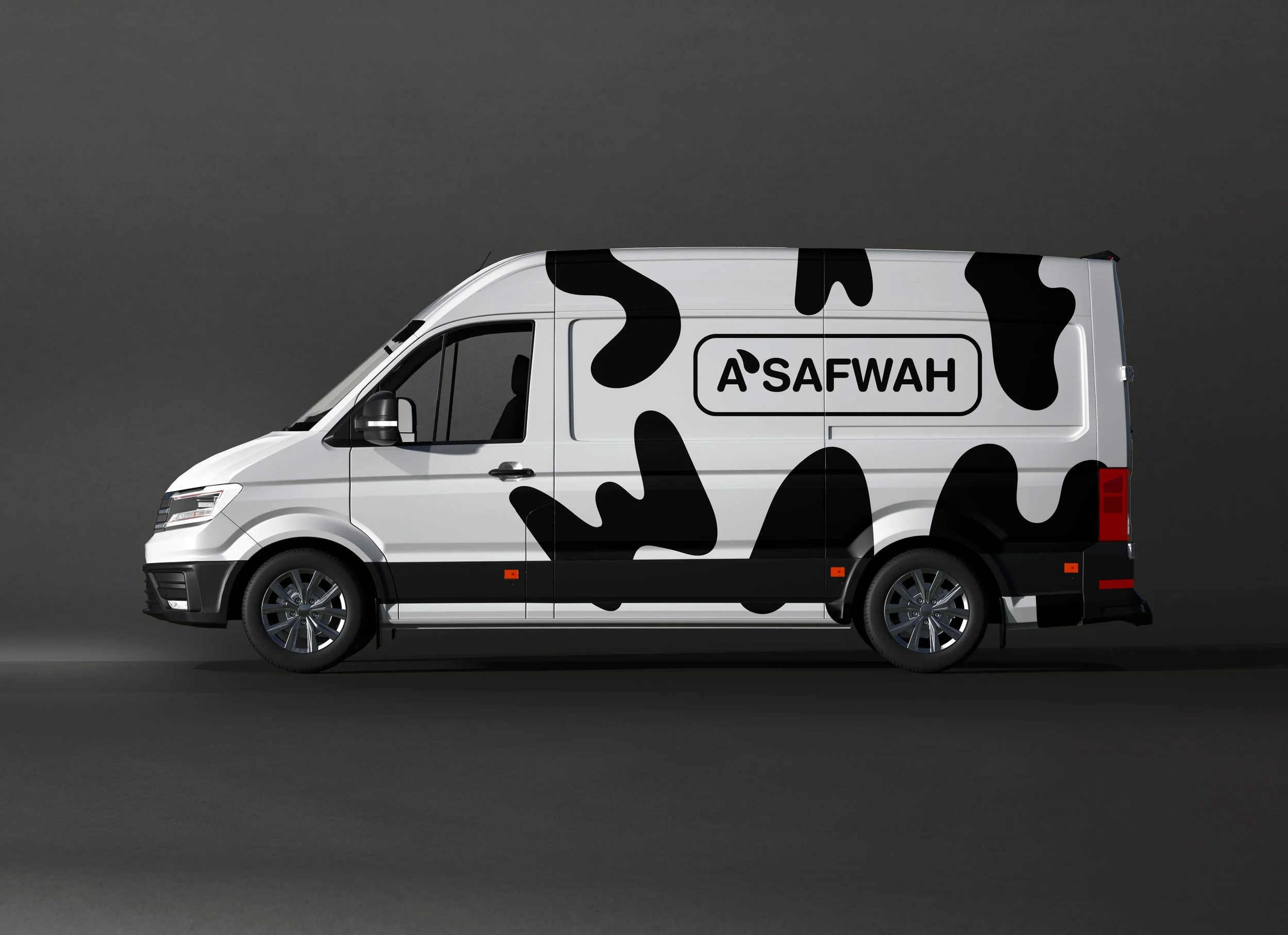
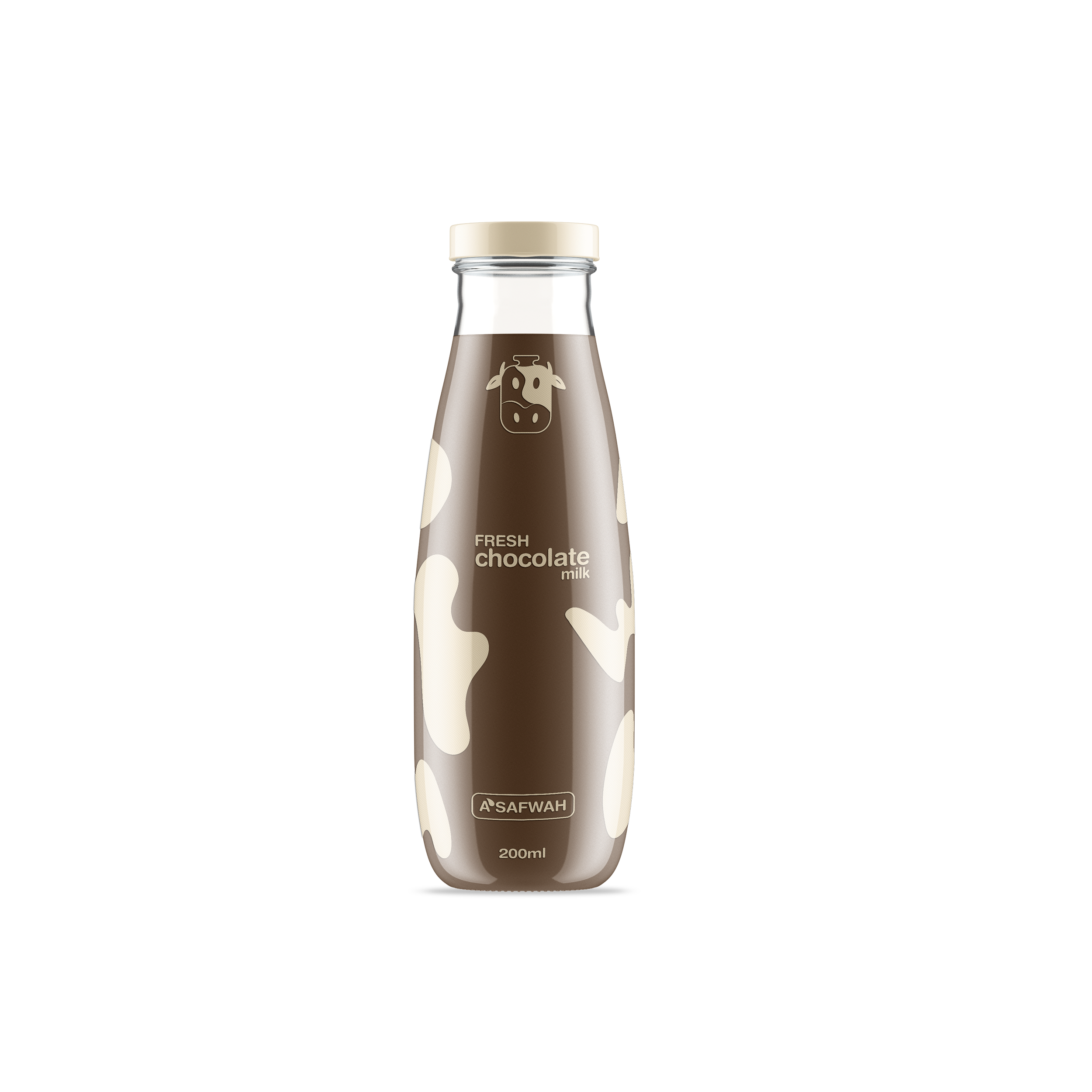
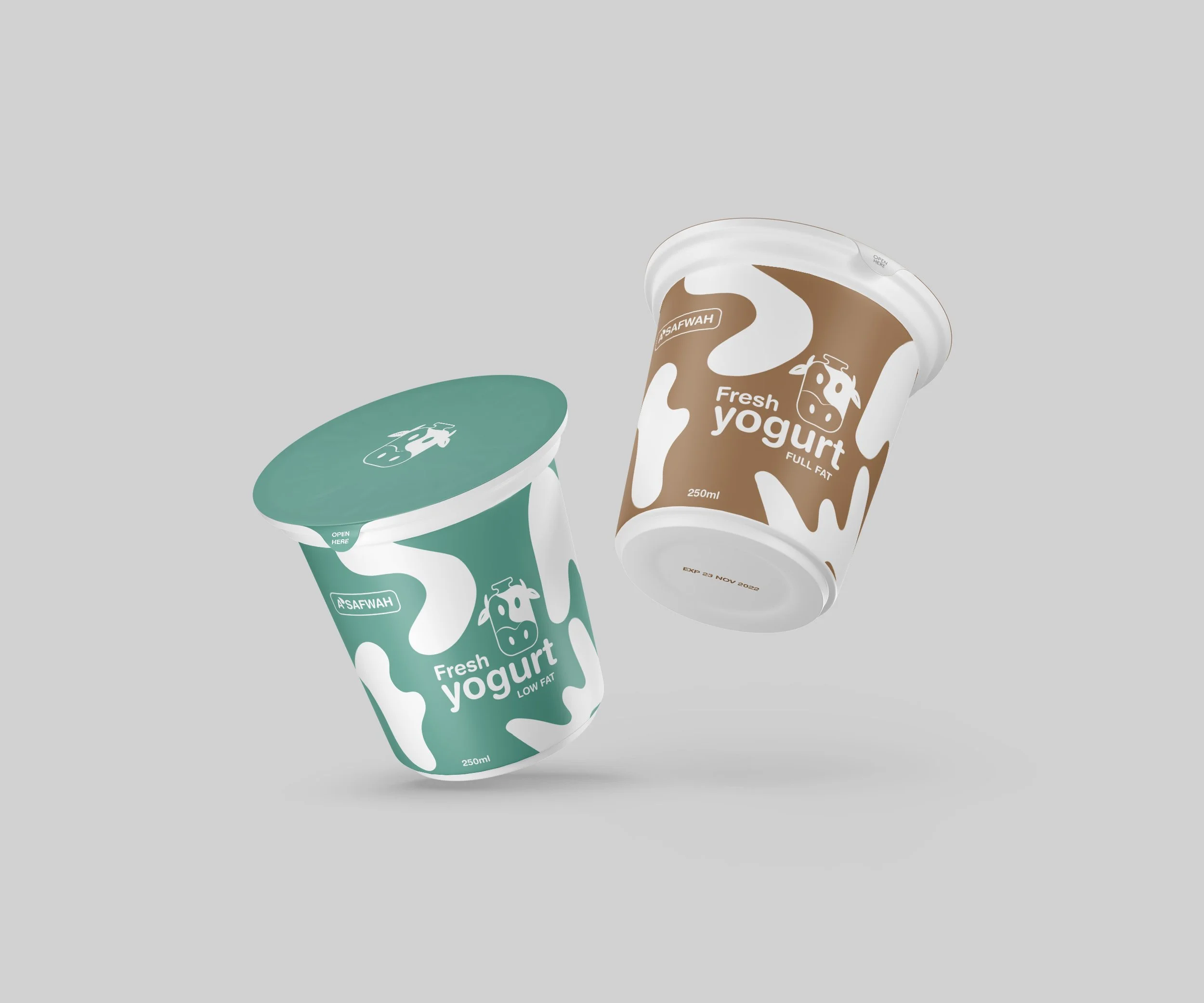
For the graphic elements, the letters of A’Safwah were hand drawn to be shaped like a cow skin. These elements can be used as a pattern, and can be implemented in different kind of designs from packaging to social media posts.

Graphic Elements Application
As mentioned, these graphic elements can be used in various designs, and in different ways. Below are some examples of how these elements have been applied.
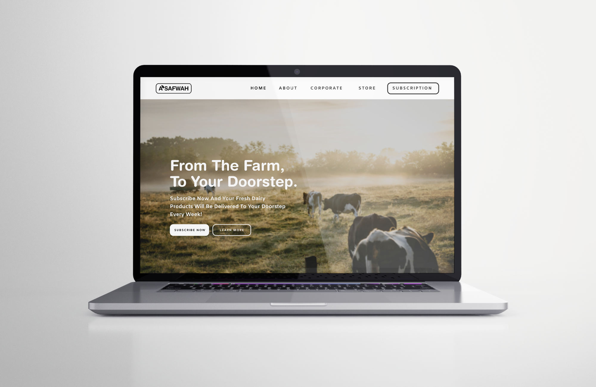
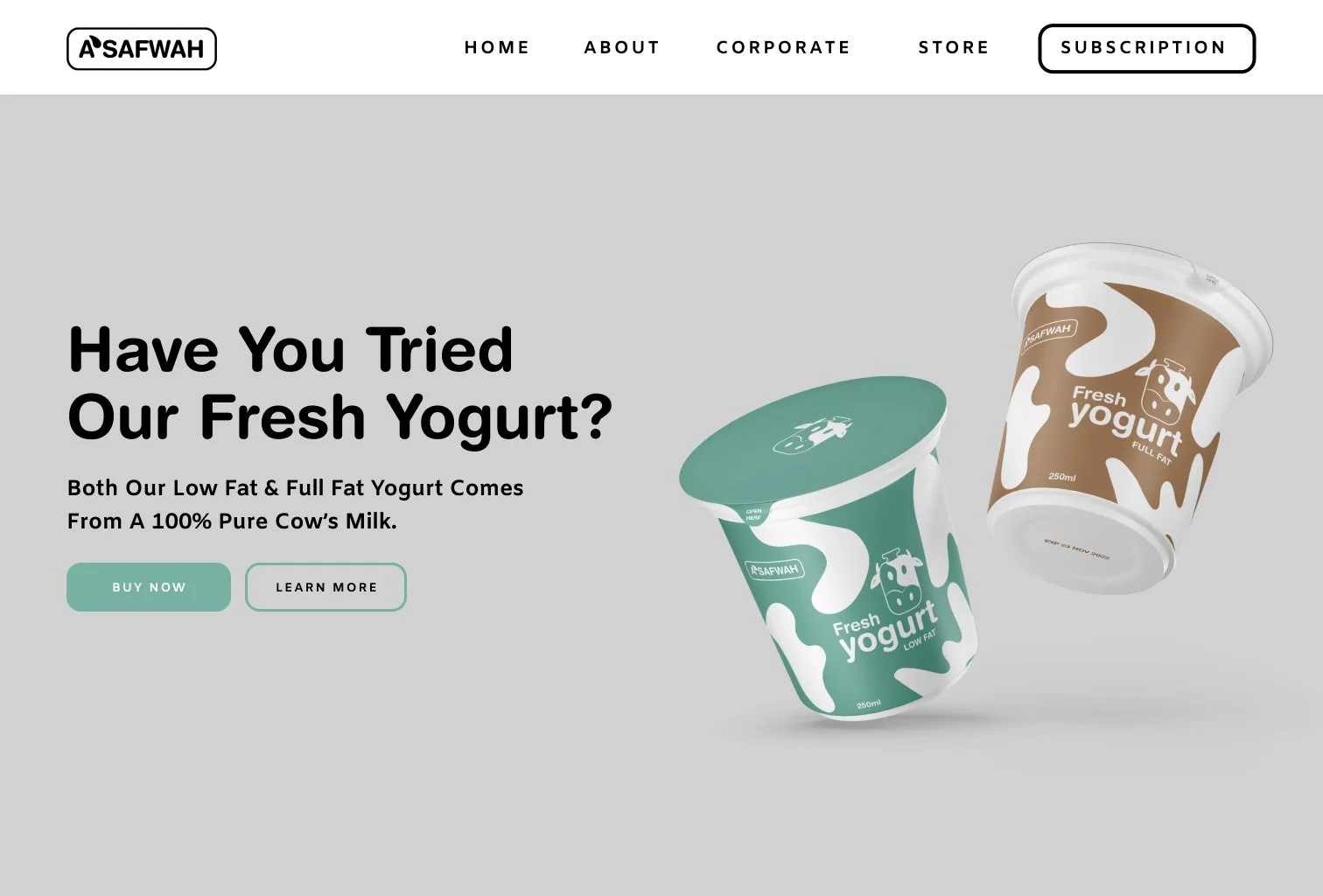
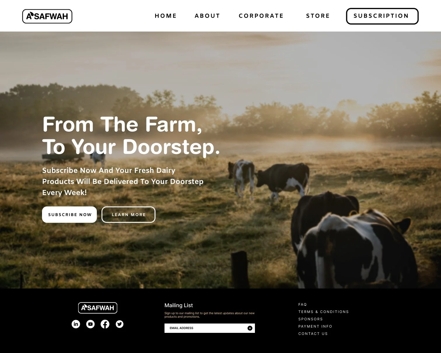
Landing Page
Since the current website and landing page of the brand is kind of outdated, i had to come up with a different design. This part of the project is still not done, i will be updating the screens soon.